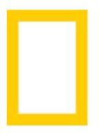
 The rectangular National Geographic logo element, here depicted, is brilliant, simple and iconic. Turn the element 90 degrees and you have a whole lot of nothing. Alter the color a shade and you have a yellow box. This little rectangle in the corner of my TV set last night watching the Sebastian Junger documentary on Syria brought to mind rich associations from every decade of my life.
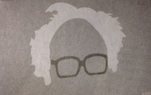
The second logo, perhaps borrowed from NY Mets tee-shirt designs dating back to Keith Hernandez (no doubt borrowed from another designer) is none other than The Bern. Does his hair always stand up like this? It does now. This line art inspired drawing is now recognizable across all earth’s timelines.
These two logo designs are elemental in adherence to product or service. They harness the power of product design and “self.” They’re amplifications of a brand’s currency. They are not an attempt at bold or lovely art, lightly tethered to a strategic idea. Too often today logo marks are design for design’s sake — a logo into which one might move the brand house.
That’s backwards.
Peace.
PS. For a deeper dive into using logos promotionally, check out this piece by Custom Earth Promos.


