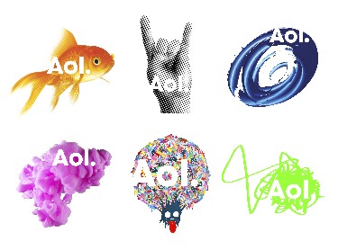
AOL announced today they will be introducing a new logo. It will include a dot at the end of the letters Aol, which will appear using initial cap “A”, lower case “o” and “l”.
That’s the post. That’s all I learned. See you tomorrow.
(Okay, okay, I learned a little more than that, but had to read between the lines to do so.)
AOL has a product strategy, which I’ve known for a while thanks to new CEO Tim Armstrong. It is “AOL is the place to be for the best online content, period.” Mr. Armstrong articulated this strategy early on in his tenure. It’s tight and smart.
What they don’t have at this time is a brand strategy. Had they a brand strategy they wouldn’t have only talked tactically about the mark in their announcement. To wit (from an article by Stuart Elliot in the The New York Times today):
“The period in the logo was added to suggest confidence, completeness.”
“The AOL dot is the pivotal point for what comes after AOL.”
“An advertising campaign to promote the new look is being considered — as is the role to be played by AOL brand character known as the running man.”
You feel me? All tactics (hat) no brand strategy (cattle.)
Changing the logo was a good idea, but doing so after articulating the brand strategy and brand planks is way more sensible. Peace!


