I had a discussion with an Asheville, NC brewer last year who was in the process of doing a brand redesign with a branding shop based in Texas. They did a lovely job, by the way. The topic of taps came up — taps being the long ceramic bar-top devices used to pour beer.
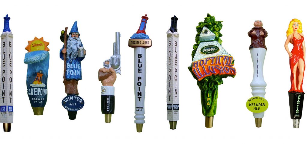
Having poured a little beer at the Bluepoint Brewery taproom back in the day, I recognized up close how tap designs can be a cool branding “thing.” Bluepoint, I was told, used a California-based tap manufacturer and paid a handsome price per piece. Each tap had a unique grab, including mermaids, monks, Rastafarians, lighthouses, buoys, etc. All distinct and memorable. When I shared this with the Asheville brewer, who perhaps had been bitten a little too hard by the branding bug, she suggested the lack of brand continuity was a weakness.
Out for a quaff last Friday at the Mellow Mushroom, a local joint with over 100 beers on tap, I noticed about 5 or 6 of the local brewer’s beer taps. All had the same logo, all had the same block letter typeface for the beer name, all sporting a different color for package differentiation. Very corporate. Very easy to read. Beer personality: Zero.
Blue Point got it right. Each beer is a brand. Each should be celebrated as such at the local watering hole. Peace.

