Advertising

    Visuals.

    0

    There is subtext in every marketing piece.  For instance, today there is a big hubbub (and rightfully so) about a Mad Men outdoor billboard showing Don Draper in free-fall high atop a building on the West Side of Manhattan.  (The board is 95% white space.) To show watchers it’s an iconic visualization of the show and Don Draper’s life.  To New Yorkers and others who lost friends and loved ones 9/11, it’s an insensitive punch in the como se llama. 

    Visuals, more than words, tell immediate stories. We need to be mindful.  Pictures that show danger may be eye-catching but convey danger which research shows can transfer that feeling subconsciously to the brand.  Imagery that conveys happy (Coke’s happiness factory) can transmute smiles.  Visuals that depict chaos or disorganization similarly hurt an organization story.

    Ergo, think before you select a visual.  Not everyone sits around a computer for hours trying to select a visualization to match a brief.  Most pass marketing pieces with nary a glance.  So look up. Stay true. Be sensitive. Peace.

    Target Ad a Bulls Eye.

    0

    There is a Target spot running on the Olympics showing high school seniors opening up their college acceptance letters. It is riveting. Had I to do it all over again, I would have studied harder so as to live that letter opening moment.

    I don’t remember the casting or any individual kid in the spot; I do remember the excitement and raw jubilation in each performance.  Back to school ads hit August first or thereabout and typically are a bummer.  Muscle memory for back to school is the antithesis of that for the words “snow day.”   

    One of the best back to school ads I have seen was from Staples, I believe, and showed the over the top excitement of a mother packing her shopping cart with supplies, dancing and grinning through the store knowing the little treasures were going back to school. Funny yes.  Engaging yes. It did not hold a candle to the Target spot; a spot so pregnant with possibility, aspiration and energy it almost made me smile out loud (SOL). The target spot was about a celebration that should tie parents and kids to the Target brand. Even subliminally.

    This is an ad, yet it has the power and depth to be a brand idea. Great work Target. You learned a lot from Wieden+Kennedy. Good on you. Peace!

    Where is the Original Art?

    0

     I was just flipping through CIO Magazine looking at the ads and here’s what I found.   There were 17 full page ads: 8 were all type, 4 used simple product shots and the rest clip or stock art.  What would Don Draper say?  And I’m talking about ads from companies like HP, Dell, CA, Symantec and Palm — companies that should know better.

    Let’s not even get into whether the ads have an idea, support the brand strategy or are well written.   B2B print advertising today is a joke.  If it wasn’t for clip art, there would be no art.  The people tossing these ads together (tossers) are not professional ad crafters, they’re drag-and-droppers.  This is “We’re here!” advertising at best.

    Corporations that allow this type of work are lazy.  I know the economy is poor and companies are looking for ways to cut corners, but let’s put a little art back into selling.  No wonder print is dying.  Sad.  Peace!

    Spam Words.  

    0

    The unsub button is set you to allow you to stop unwanted emails. The first options is

    __ Too many emails.  The second is

    __ Not relevant to me.  The third is

    __ Too promotional.   And the fourth is

    __ I don’t know why I’m receiving these emails.

    They put the first one in that position to increase the chances of it being elected. Then the email company can argue spam emails are not so bad there are just to many of them…and stay in the spam business. Just with a bit less frequency.

    Spam is to email what TV commercials are to broadcast TV. Unwanted intrusions.

    Brand planners are all about relevance. And salience. Advertisers are about attention. Email marketers are clicks. And marketers are all about selling…and all of the above. The problem with most of the above, is that it negatively impacts relevance and salience. Consumers are conditioned not to believe certain words.  Certain claims: better, faster, tastier, cheaper. These are spam words.

    Brand planners have to weed out the spam and identify new ways of conveying value. New strategies to garner interest, desire and action.

    I like Spam on sliders, not in my copy.

    Peace.


    Badvertising.

    0

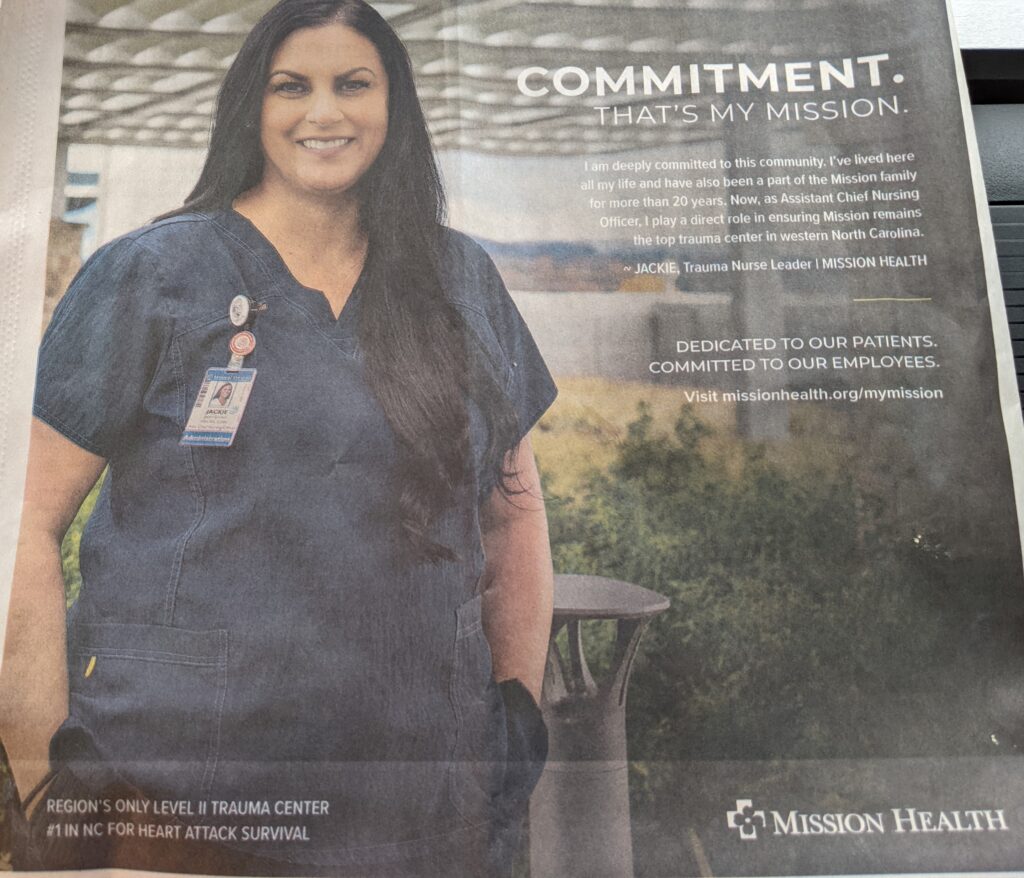
    Mission Health headquartered in Asheville, NC and owned by for-profit hospital group HCA out of Nashville has been under fire for a couple of years since its purchase.  Quality of care issues have arisen, as have the cost of care, and physician attrition. Mission has some image work to do.

    Hospitals are notoriously bad advertisers. The occasional big brand hospital invests in a good ad agency and the work turns out well, but that’s the exception.

    The ad herewith from Mission Health is an example of poor ad craft.

    The one-word headline “Commitment” is lazy. Even with the subhead “That’s my mission,” an obvious play on the brand name, the line is meaningless. These are the words of trauma Nurse Jackie, the ad’s visual:

    “I am deeply committed to this community. I’ve lived here all my life and have also been a part of the Mission family for more than 20 years. Now, as Assistant Chief Nursing Officer, I play a direct role in ensuring Mission remains the top trauma center in Western North Carolina.” 

    Below this quote are the words “Dedicated to our patients. Committed to our employees.

    Let’s parse the communications. Nurse Jackie is committed. That’s the claim. But the only proof of this (commitment) claim (better known as reason to believe) is that she has worked at Mission for 20 years and been promoted.

    You can’t make a claim in an ad and not prove it. It’s a waste of money. And commitment is just about the most common ad strategy for hospitals since “care and caring.”

    I really, really want Mission to succeed.  They do a lot of good medical work in the community. But when it comes to advertising (and branding) they’re not committed.

    Peace.


    McAfee Advertising, Way Asleep.

    0

    So is the brand pronounced Mac-a-fee or Mih-Caffee.  (Hoe-gaarden or Who-Garden?) One of a brand’s first challenges is to make sure the name is pronounced correctly.  McAfee is a killer PC protection software product, which, if I’m not mistaken. is #1 or 2 in the marketplace.  It was purchased earlier this year by Intel.   I’m a 3-license custy and couldn’t be happier.

    But, as an ad rat (a gym rat for ads) I can’t help but see that McAfee needs a marketing boost.  There is an ad in the newspaper today showing the McAfee logo as a superman emblem on a man’s chest. The pithy headline reads SAFE NEVER SLEEPS. A line they give a TM.   Not sure if it qualifies as copy but in small text beneath the line reads (I’ll save you the caps) “Smarter security. Every device, every network, everywhere.”

    Classic “we’re here” advertising.   Is it any wonder digital advertising is cutting into traditional ad budgets?  This is some lazy stuff.  I’m not sure I can even type anymore I’m so disappointed. There is no claim here. And no proof.  Only colors, type and photography.  Why does the McAfee marketing dept. bother to get out of bed in the morning?  Are you kidding me?  What’s the idea?

    Words Are Important.

    0

    I was listening to a radio commercial this morning in which Joe Torre and the president of J.H. Cohen are prattling on about professionalism and category experience in the consulting and accounting business.  And it’s bad, so I’m really only listening for how poor the performances are — not really hearing the words.  And then president or announcer recites a list of fluff ending with “unmatched integrity.”  WTF!  Is anyone reading this shizz?

    Advertising Claims

    There was a time when you couldn’t just poop out claims on the radio. Or in print.  I suspect they are a little more vigilant in the TV standards and practices depts., but today you can say just about anything on the radio. Maybe that’s why advertising is so ineffective.  Anyone can say anything.  “Unmatched integrity?”

    If Coors Light can say it’s the “world’s most refreshing beer,” what does that make all the competitors?  Is someone sleeping at the switch?  Words are important; anyone in marketing will tell you that.  As we make words less important, is it any wonder that we need the algorithm to help us find our arses.  Peace.

    Credit Card Advertising.

    0

    McCann-Erickson’s “Priceless” campaign for MasterCard is arguably one of the most respected credit card campaigns to come along in decades.  “It’s everywhere you want it to be” was a great ubiquity campaign for Visa, but that’s long gone.  The problem with advertising is that sometime the advertising becomes more important that the product.  Priceless is an example of an advertising idea that overshadows the card.  Emotional attachment to a brand is important in terms of tone — and that’s what the campaign does so well.  But it is an advertising dimension. Products that tie their horse to an emotion (Coke are you listening?) rather than product benefit or quality are using advertising to get attention.  Or remind us to pay attention.

    MasterCard, has done some very cool innovative things like PayPass and smartphone apps yet is sadly still famous for its priceless advertising. No matter how much it tries to make PayPass priceless, the ads are still about a smiling kid in a baseball hat.

    Today MasterCard’s tagline is “That’s MasterCard. That’s Priceless.”  The “That’s Mastercard” portion takes a register mark so it looks as if they are beginning to think about evolving away from Priceless and straddle two ideas.  But “That’s MasterCard” smells like an empty vessel. This is a tough category, but for far too long it has been managed by ad people not marketers. It’s time for that to change.  Peace.  

    Truth and Conspiracy.

    0

    Brand planners pay close attention to popular culture in an attempt to massage their ideas and selling schema into it. One hugely impactful, popular cultural construct today is demand for disinformation, especially related to politics and conspiracy.

    Disinformation, it seems is much more interesting than typical truthful information. And when I say truthful information, I’m here talking about advertising. Nobody needs to hear me talk about advertising bombardment, it’s a given. And add to that, eighty percent of advertising is bad.

    Bad advertising shares commodity claims with little proof. “Fred Anderson Toyota offers the best customer service,” for instance. Is that misinformation? Prolly. Multiply that by 100,000 and you begin to see why consumers are not real believers in the craft. But in today’s environment, uncover a little conspiracy and you have a person’s attention.

    In a recent strategy written for a potty training company, I uncovered a conspiracy worth hundreds of millions of dollars. Diaper companies were productizing and strategizing ways to keep children in diapers longer. And it worked. Fifty years ago kids were out of diapers by 18 months. Today it’s closer to 36 months.

    Manipulative, greedy marketing is the worst type. People don’t want to be pushed around.

    We are still up to our asses in diapers (hee hee), but this conspiracy has gotten more than a few mothers angry and we’re moving in the right direction. Truth Well Told.

    Not every advertising and market campaign can be a movement, but it won’t hurt planners to dig a little deeper and give the people the drama they crave.

    Peace.


    PTLLM

    0

    People that look like me.

    Are you tired of staged photography in your ads? Are you happy with all the gratuitous diversity and inclusion casting in TV commercials?  It is wonderful seeing gay couples in ads, but why always on a couch?  How about casting ads with we the people? People not trained to smile for the camera? There is some progress, we are beginning to see some larger people in TV commercials, but less that 5 percent by my count. I also recently saw a woman with freckles in The New York Times Magazine section.

    Are you one of those people who watch a hockey or football game and says to the screen or your honey “Sure are a lot of while people there?” I do.  I’ve even started a meme on social media where I comment “White much?” when diversity is totally and ridiculously white.

    Here’ my point. Casting has a new imperative. More real people. No one wheel chair a quarter. Don’t check both boxes by using a mixed race couple with two dads. Real people. Zits and all.

    All those marketers talking about authenticity need to shut up and cast like they mean it.

    Peace!