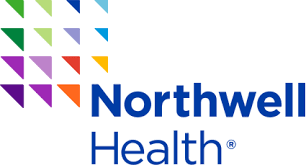
The Northwell Health logo replaced the North Shore-LIJ Health System logo a few years ago, following a well-funded name change project. I worked on the North Shore brand shortly after North Shore University Hospital and Long Island Jewish Hospital merged to form the ungainly named North Shore-Long Island Jewish Health System. In between those events, about 10 years ago, the directors and board members agreed to drop the word “Jewish” and go with North Shore-LIJ during another logo refresh.
All history, provenance and histrionics aside (and it’s a fascinating story, probably would make a good movie), I’m here to talk about the new Northwell logo.
At first glance, the 14 (or 15 in some cases) colored triangles making up the mark set your hair on fire. Who does a logo with all those colors? With all those different size shapes? When logos or brand marks were first crafted (Bass Ale?), they were likely carved or burned into wood necessitating simplicity. Then Gutenberg came along and logos had to be printing-press ready. Business cards and the yellow pages then arrived, shrinking logos even further. But today, in the age of PNGs, hi-def mobile cameras and 3D printers, creative minds aren’t bound so. Reproducing a cacophony of color shapes and sizes may make the head spin but they are recognizable…and that’s the name of the game. The geeze in me says “no,” the aesthetic says “yes.”
Onward. Peace.
